-
Hubbell Lighting Components (later called Current Lighting)
-
The brand’s reputation in the industry had been under scrutiny and they needed to give it new life. What had started as two partnering brands (TRP + Norlux), were to be merged into one: Hubbell Lighting Components (HLC). The existing brand(s) lacked consistency and struggled to communicate the value of its products in a way that felt credible, modern, and differentiated. Messaging was fragmented, visuals were inconsistent, and the overall experience didn’t reflect the level of innovation behind the products.
This created friction across marketing, sales, and customer understanding.
-
Brand identity system
Visual language + design principles
Messaging direction
Website design
Marketing collateral
Advertising campaigns
Tradeshow experience
-
I Led the brand transformation end-to-end, partnering closely with stakeholders to define the strategic direction and translate it into a cohesive visual system.
This included:
Defining the brand foundation and positioning
Developing scalable design systems and templates
Ensuring alignment across marketing, product, and sales
Guiding execution across digital, print, and experiential touchpoints
STRATEGIC brand REPOSITIONING
This engagement focused on repositioning the brand to better reflect the sophistication of its offerings and the expectations of its audience. The goal wasn’t just viual improvement, it was clarity, cohesion, and a system that could scale across every touchpoint.
More than that, it was about building a brand that could communicate with greater precision, create stronger alignment across marketing and sales, and hold up consistently wherever it appeared.
The Persona
The target audience required a balance of technical credibility and human clarity. The visual and messaging approach was designed to communicate expertise without feeling overly clinical: grounded, confident, and approachable.
First is always research- about the industry, the brand’s products, competitors and the brand’s demographic. Then a persona was developed. It’s majority was a 25–35 year old male engineers, looking for something new, relevant and something with meaning.
Research was also done into the lighting components industry about colors used. HLC wanted to be different, but not so different that it pushed people away. The main colors in the lighting components industry were shades of blue and green. I went directly in-between the two and chose a teal color; a mix of green and blue.
The result is a brand that feels considered and authoritative, without losing accessibility.
Snow
#ffffff
Moon
#9b9d9e
Ivy
#1f9d7f
Midnight
#0f0e0c
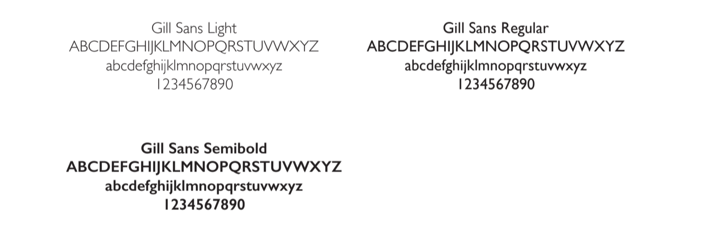
The typeface
Typography was selected to support clarity and hierarchy across complex information. The system balances structure and flexibility, allowing for consistency across applications while adapting to different contexts.
the Brand system 👇
the Brand system 👇
Rather than a collection of one-off assets, the focus was on building a system- one that could scale, evolve, and maintain consistency across channels.
This system provides the foundation for future growth while reducing friction for internal teams. After being compiled, I presented to the board. Inside, you will find a few options presented as potential mock-ups for various projects like websites and proposed campaigns.
example collateral pieces
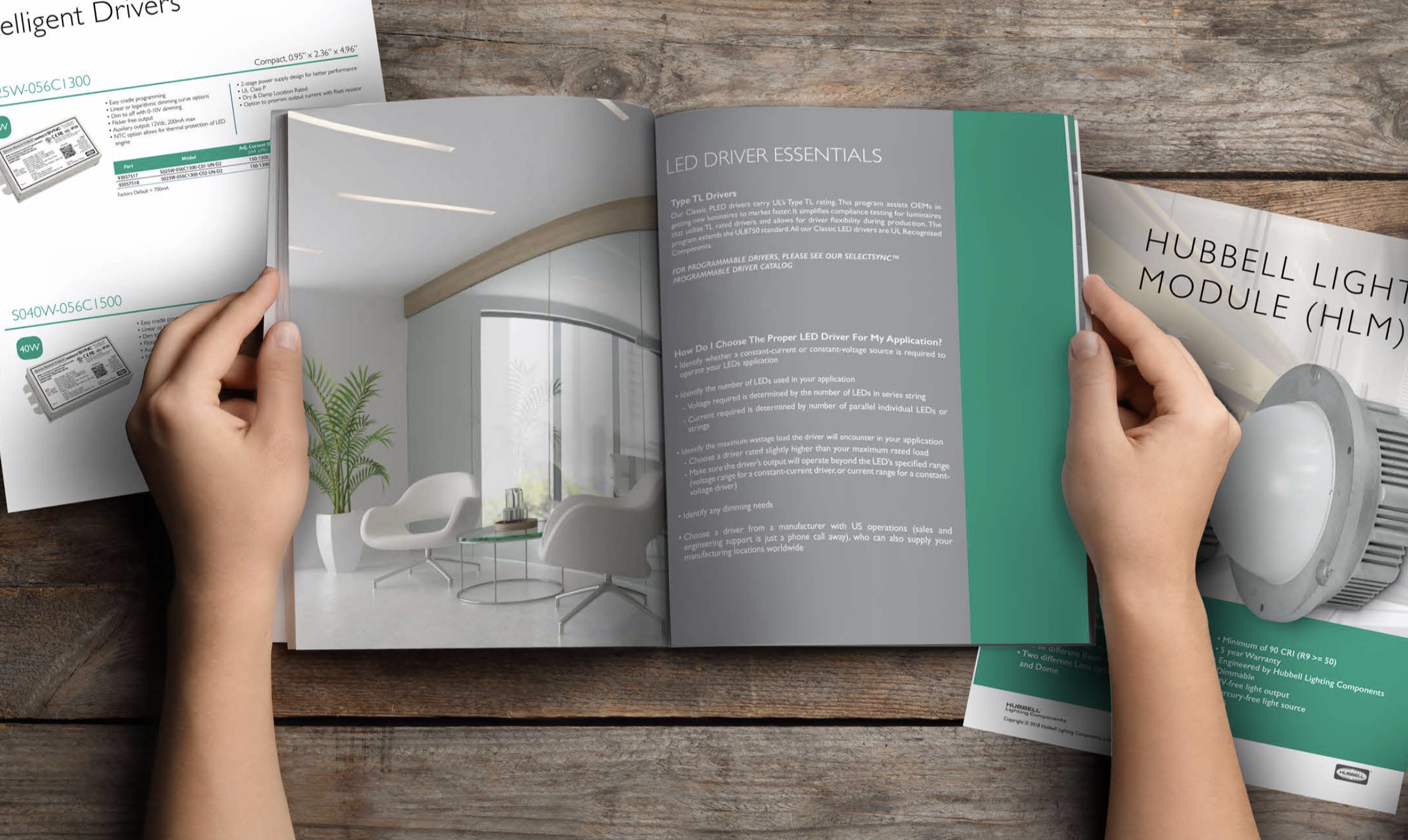
A range of collateral was developed to support marketing and sales efforts, ensuring the brand shows up consistently across print and digital formats.
Each piece reinforces the same visual language and messaging hierarchy, creating a more unified experience.
All of the brand’s collateral, website, tradeshow materials, emails and videos needed re-brandeding. I started with what would be the company’s main brochure.
the website
The website was redesigned to better communicate the value of the product and guide users through complex information with clarity.
The focus was on simplifying navigation, improving content structure, elevating the visual experience, and aligning messaging with audience needs.
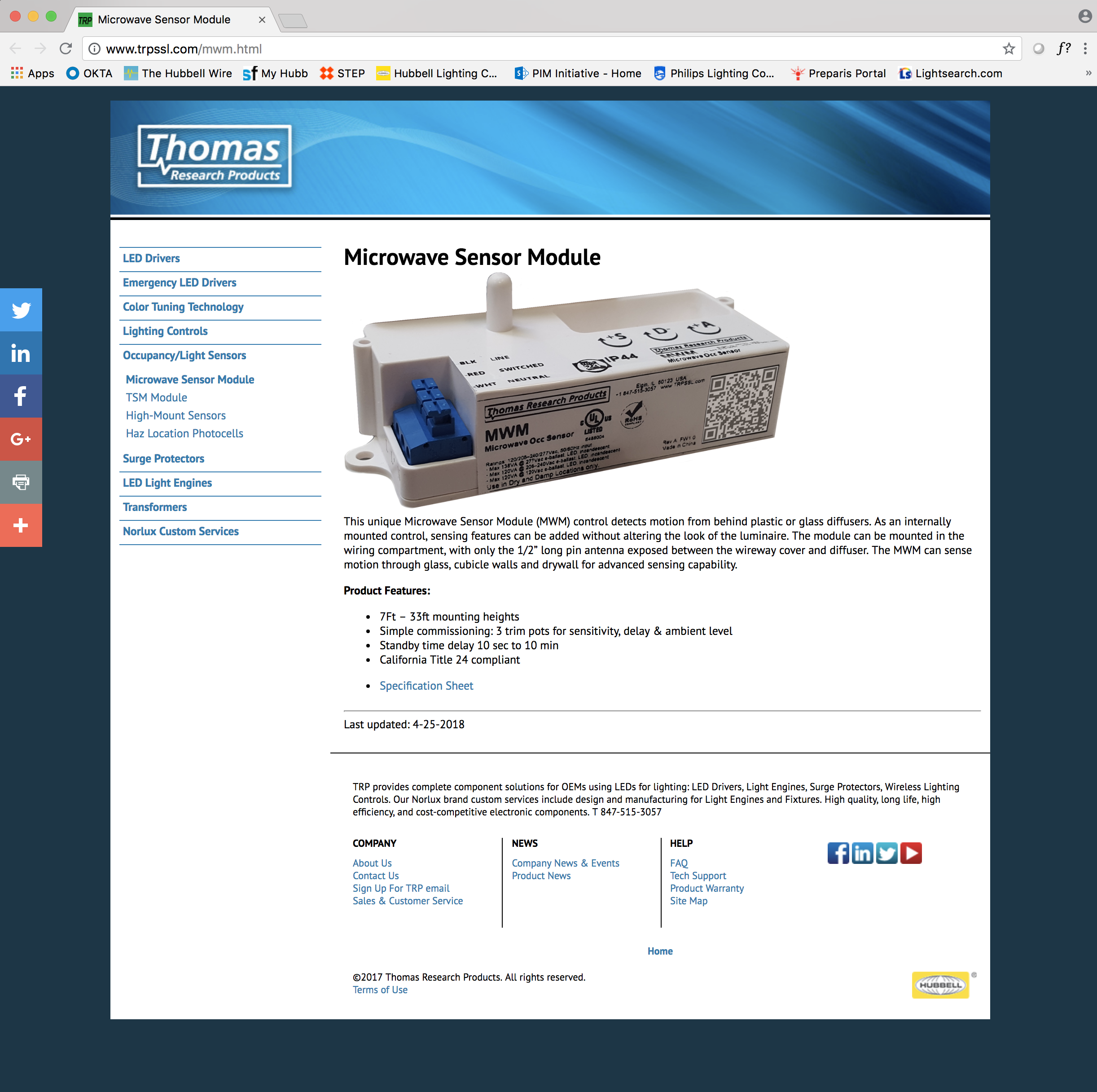
Before 🫣
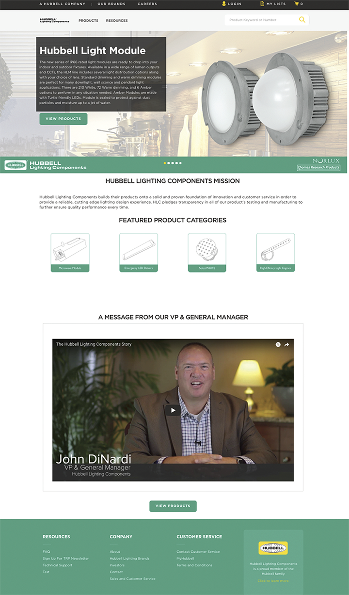
Re-designed 😮💨😌
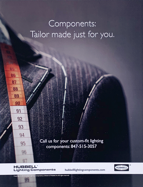
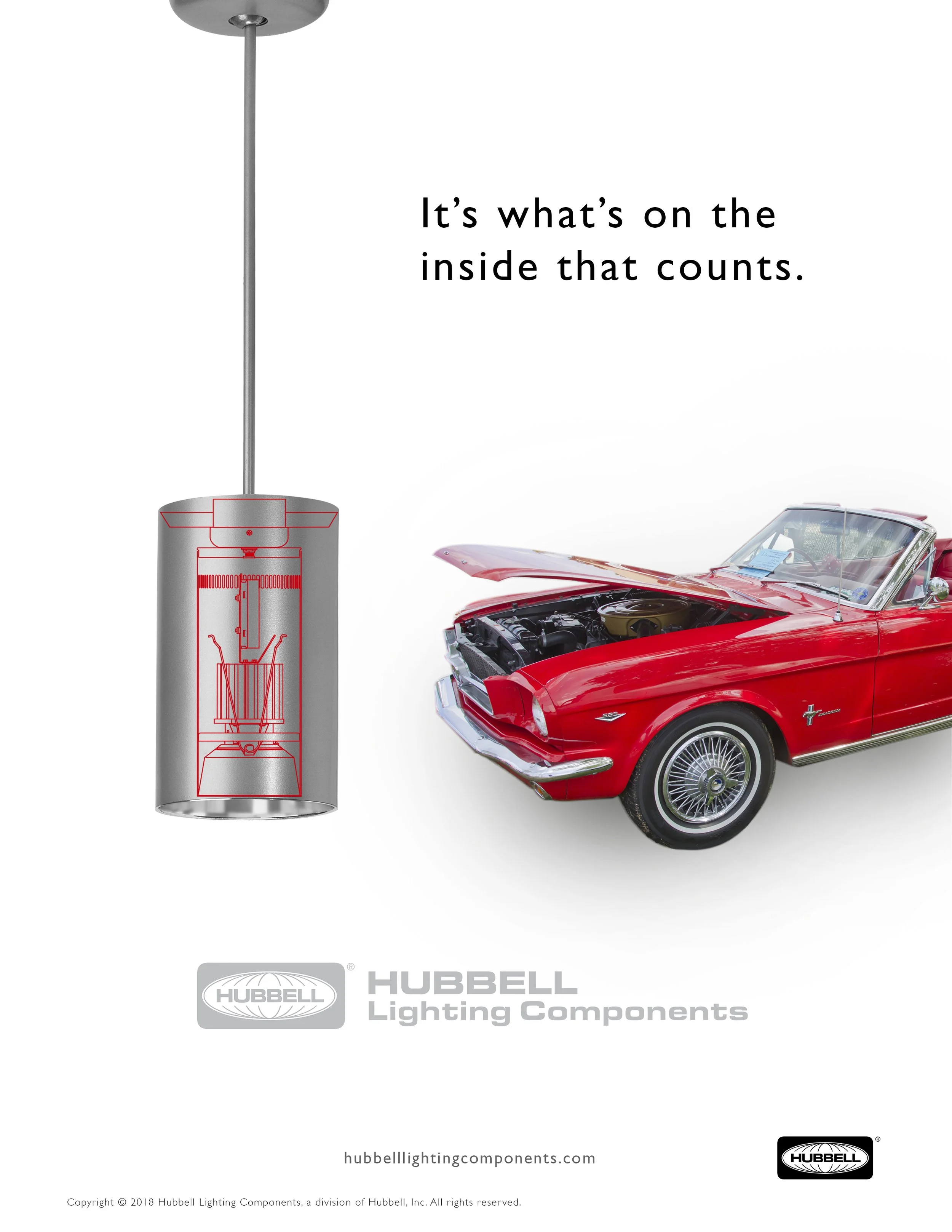
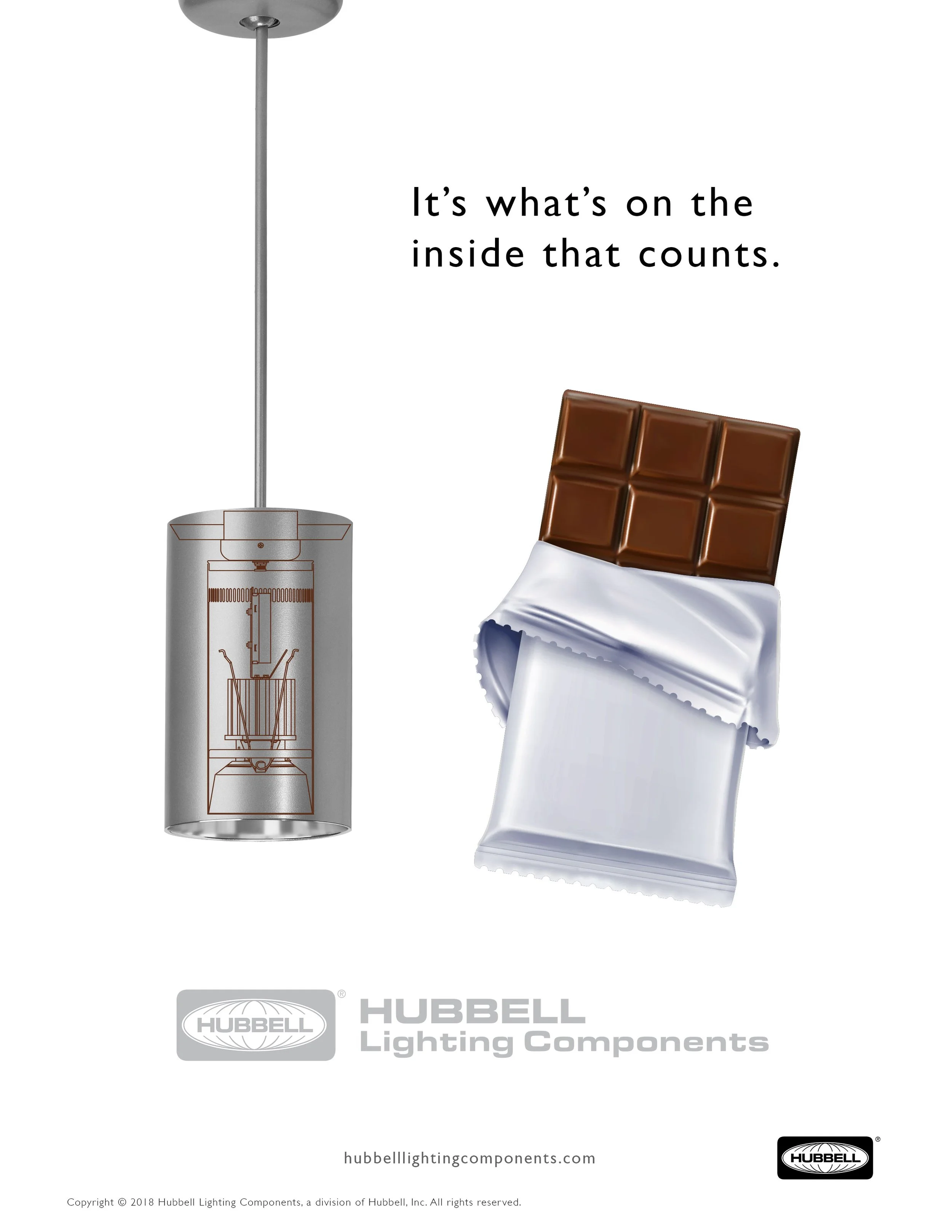
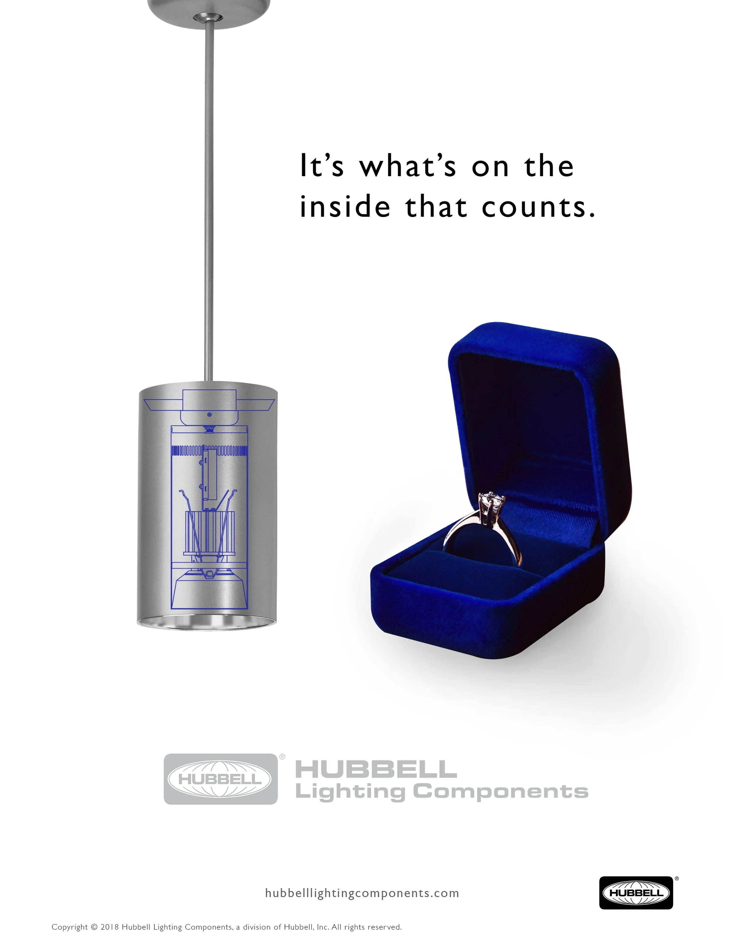
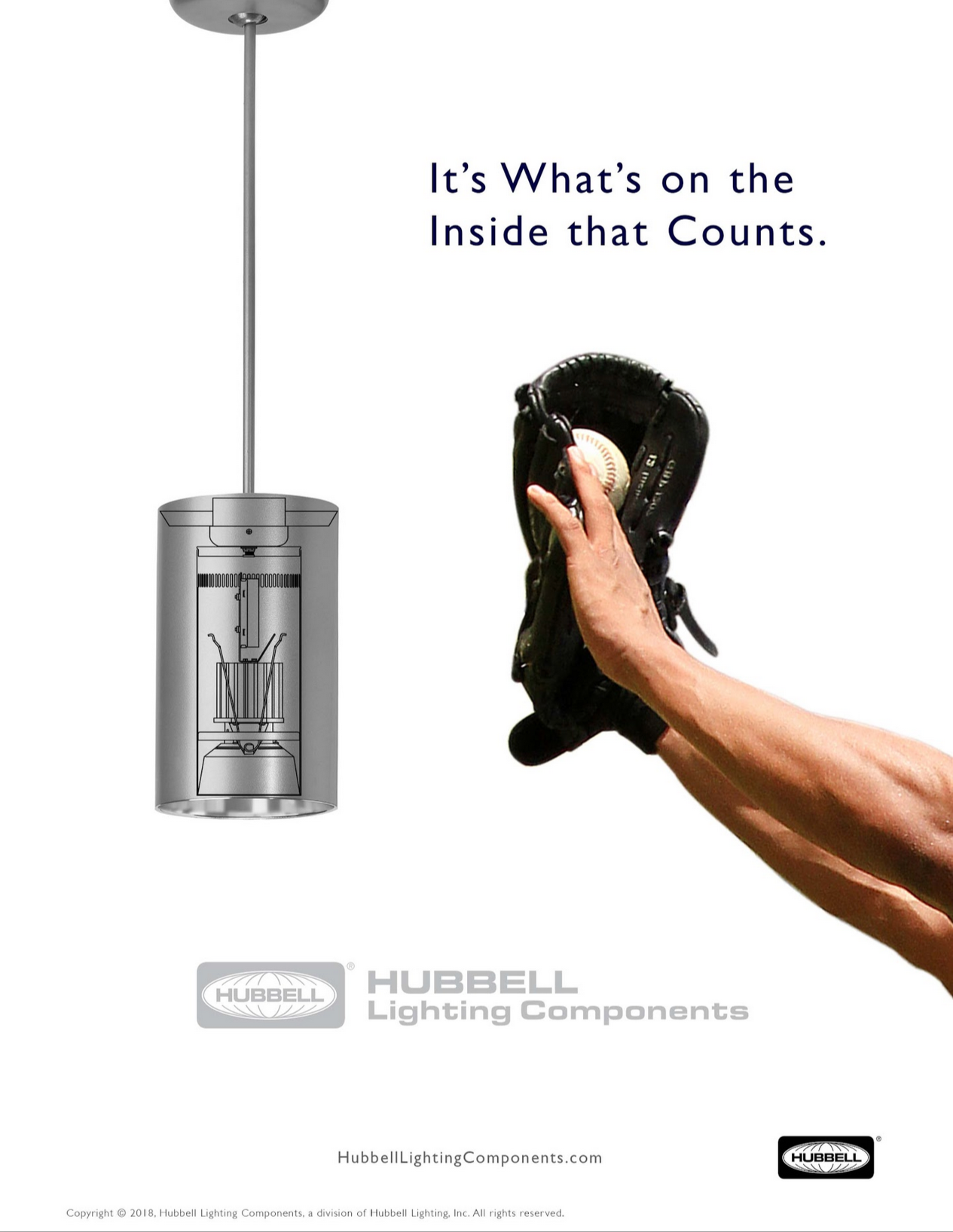
the ads
“its Refreshing to see something clean and current in a lighting components magazine that is normally dated and filled with wires.“
Campaign work focused on translating technical product benefits into clear, compelling visual narratives.
The goal was to create work that not only attracts attention, but communicates value quickly and effectively.
-
![]()
Test a
-
![]()
test b
-
![]()
test b
-
![]()
Test b
-
![]()
Test B
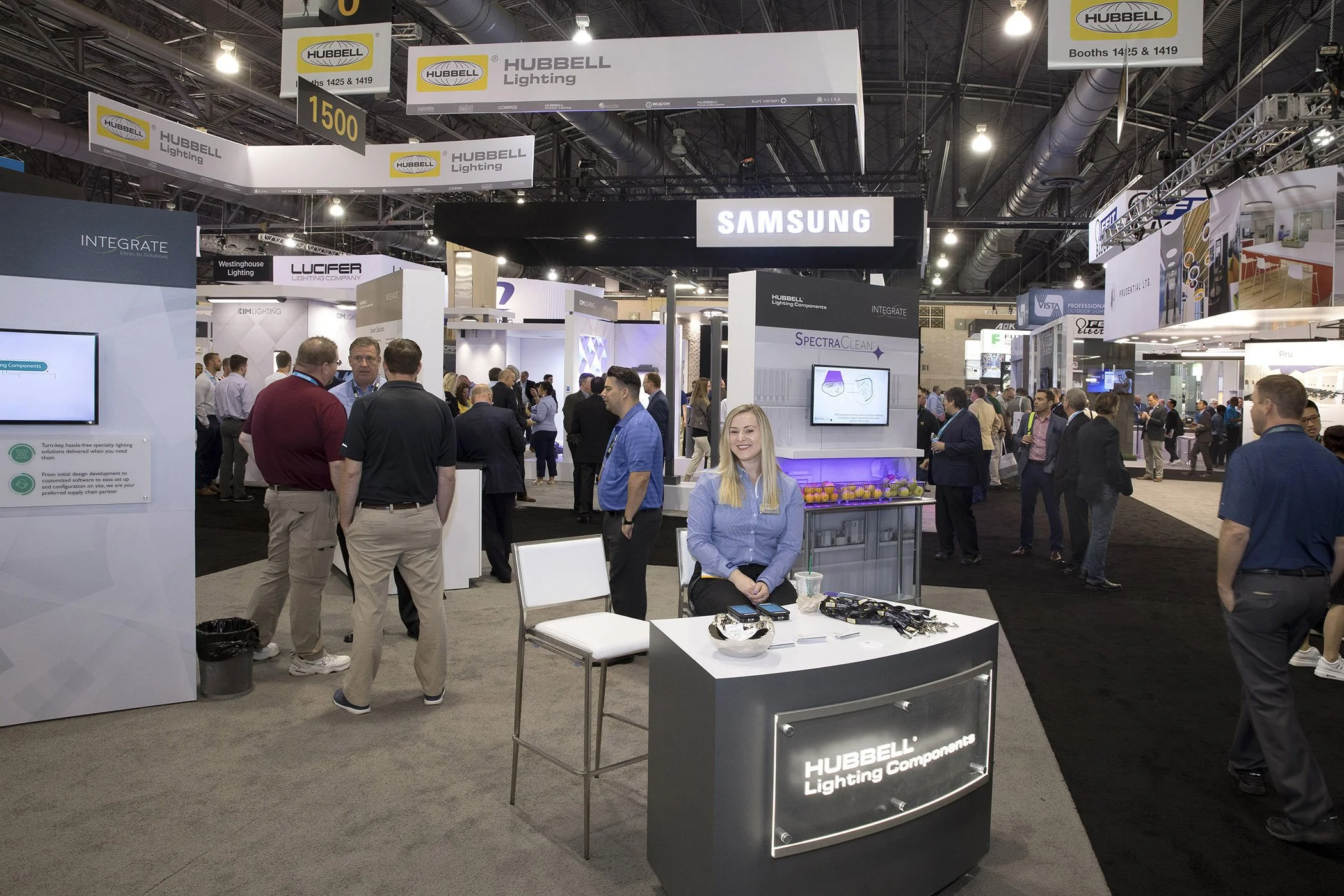
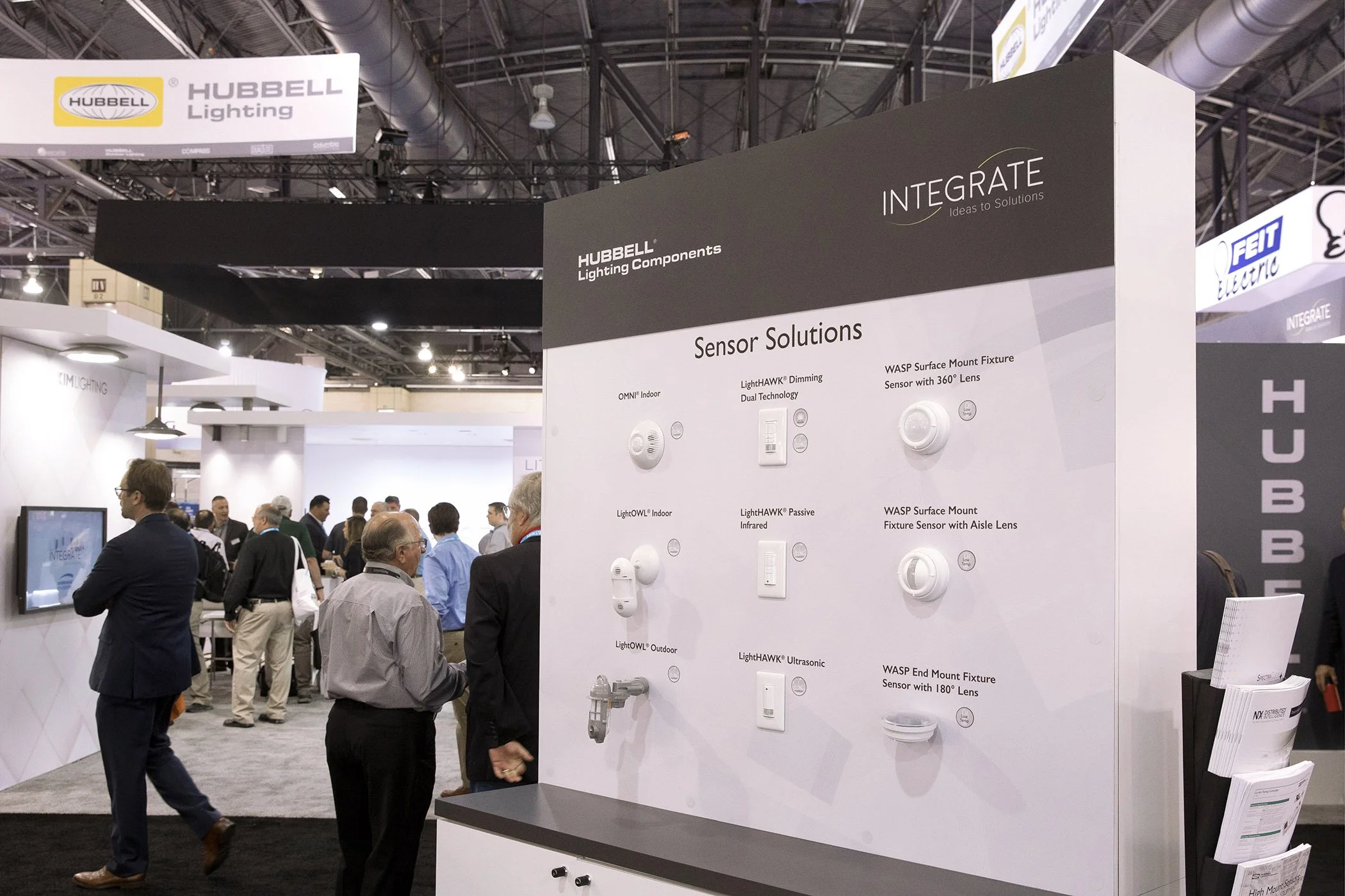
the tradeshows
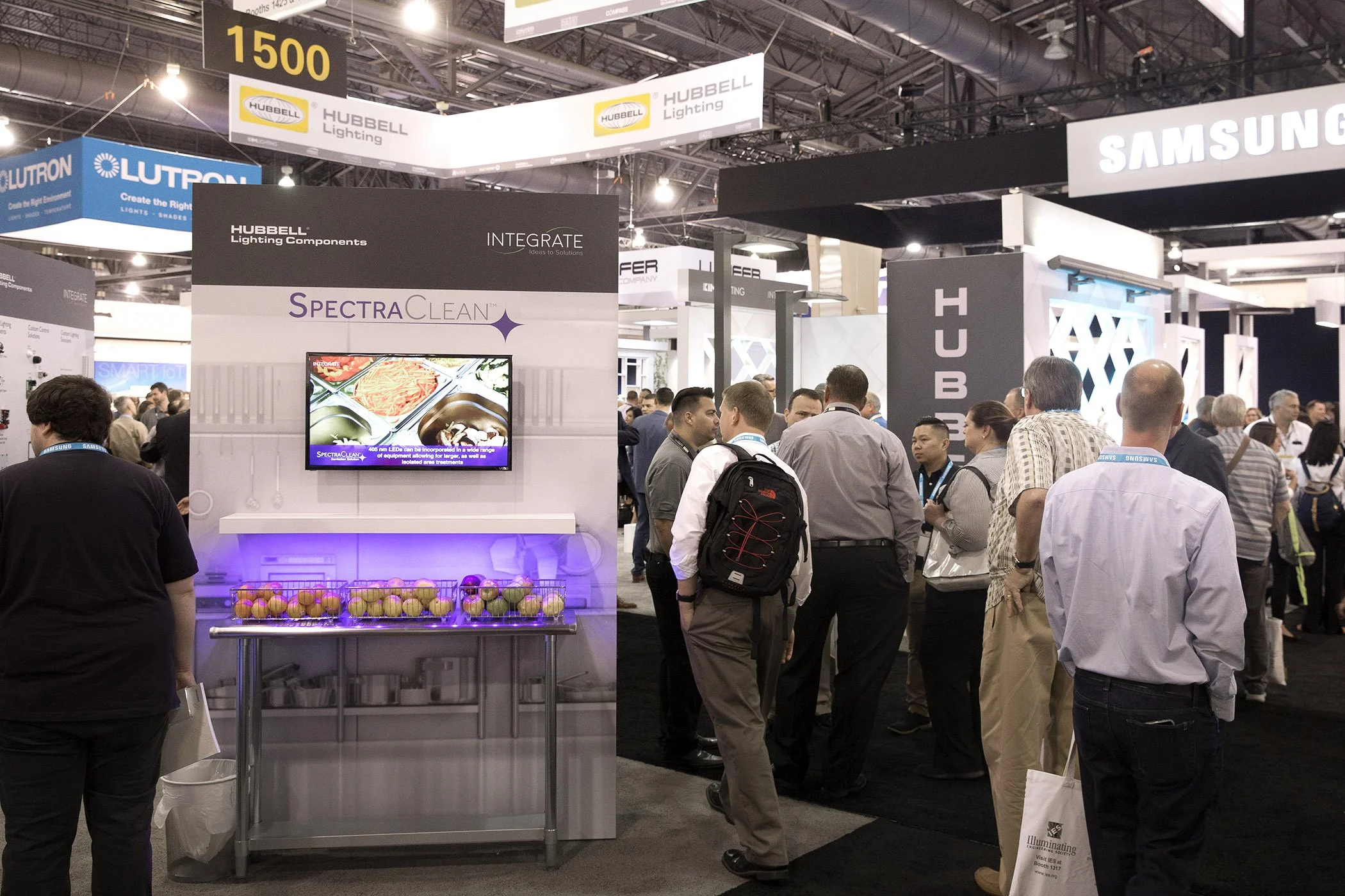
The tradeshow experience was designed to extend the brand into a physical environment- creating a space that feels cohesive, intentional, and aligned with the broader system. This included: booth design direction, messaging hierarchy, and visual consistency across materials.The result is a more immersive and memorable brand presence.
For the first environment, I created the wall graphics and developed the concept direction around a real-world product application. Because the product was a surface-sanitizing light, I framed the experience around a restaurant kitchen to make the benefit feel immediate and concrete. I extended the concept into the physical space by pairing a life-sized kitchen graphic with a half-table element projecting from the
wall, creating a more immersive booth experience. I also managed and storyboarded the product video displayed on the overhead monitor.
In the following environments, I designed and prepared the graphics featured on the nearest walls, translating complex product applications into clear, visually cohesive brand moments.
The outcome
This project pushed the brand from a loose collection of materials into something far more cohesive, strategic, and built to hold up under pressure. Instead of solving for one-off pieces, I focused on creating a system, one that could stretch across print, digital, environmental graphics, and campaign work without losing its shape.
The product offering was complex, and the old brand wasn’t doing it any favors. More importantly, it helped translate it into something clearer, more credible, and easier to understand. The brand started showing up not just looking better, but better aligned. Better equipped to support sales, marketing, and growth without reinventing itself every time it needed to speak.
That’s the kind of outcome I care about. Not decoration. Not a facelift. A brand that can walk into the room, hold its shape, and mean it.