-
ChartSpan
-
Reposition a complex, compliance-heavy healthcare brand into something clear, credible, and scalable across teams.
-
Brand strategy
Visual identity system
Sales enablement collateral
Physician-facing educational materials
Website redesign concept
Digital ad campaign creative
Social media graphics
Photography direction
-
Strategic Direction, Concept Development & Execution: Becky Ware
Copy and approval: The CEO, and Katie Walling
Repositioning a Complex Healthcare Brand for Clarity and Growth
I was brought in to lead a full brand repositioning for ChartSpan Medical Technologies- translating a highly regulated, compliance-heavy healthcare service into a clear, approachable, and scalable brand experience.
The core challenge: simplify a deeply complex healthcare compliance model into messaging that resonated with physicians, patients, and internal sales teams- without sacrificing credibility or regulatory accuracy.
ChartSpan operates where preventive care and federal compliance meet, supporting chronically ill patients while helping providers stay 100% compliant with strict regulatory standards like HIPAA, MACRA, and MIPS.The stakes are high — both financially and legally — yet most physicians lack the time or infrastructure to manage these programs effectively.
Despite operating in a highly regulated environment, the company wanted to position itself as modern, approachable, and digitally forward — appealing not only to physicians, but also to patients and their adult caregivers who increasingly engage online.
Chartspan’s needs were three fold:
01
Sales Enablement System
Transform complex regulatory documentation into concise, high-impact one-pagers that empowered sales teams to articulate value quickly and confidently.
02
Physician-Facing Educational Materials
Develop informational collateral that clarified compliance benefits while maintaining medical credibility.
03
Brand Awareness & Market Visibility
Establish a consistent visual and messaging system across digital, print, and social channels to support growth and recognition.
Brand foundations
ChartSpan retained their existing logo and primary colors to maintain brand recognition. My role was to elevate and systematize those foundations — creating a cohesive visual language that supported clarity, consistency, and scalability across channels.
Sky blue
#5eaee1
Washed Blue
#dbedf1
Soft Green
#55d892
Collateral & System Development 👇
Collateral & System Development 👇
-
![]()
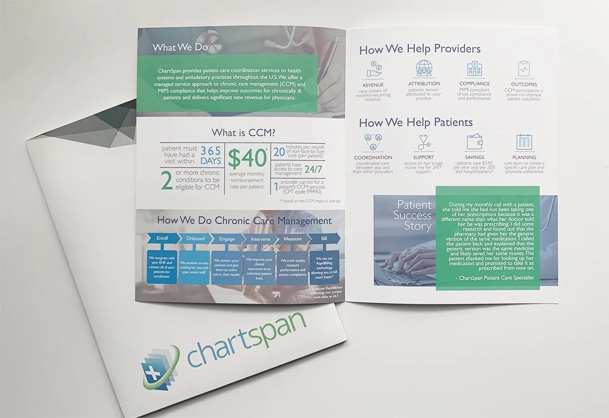
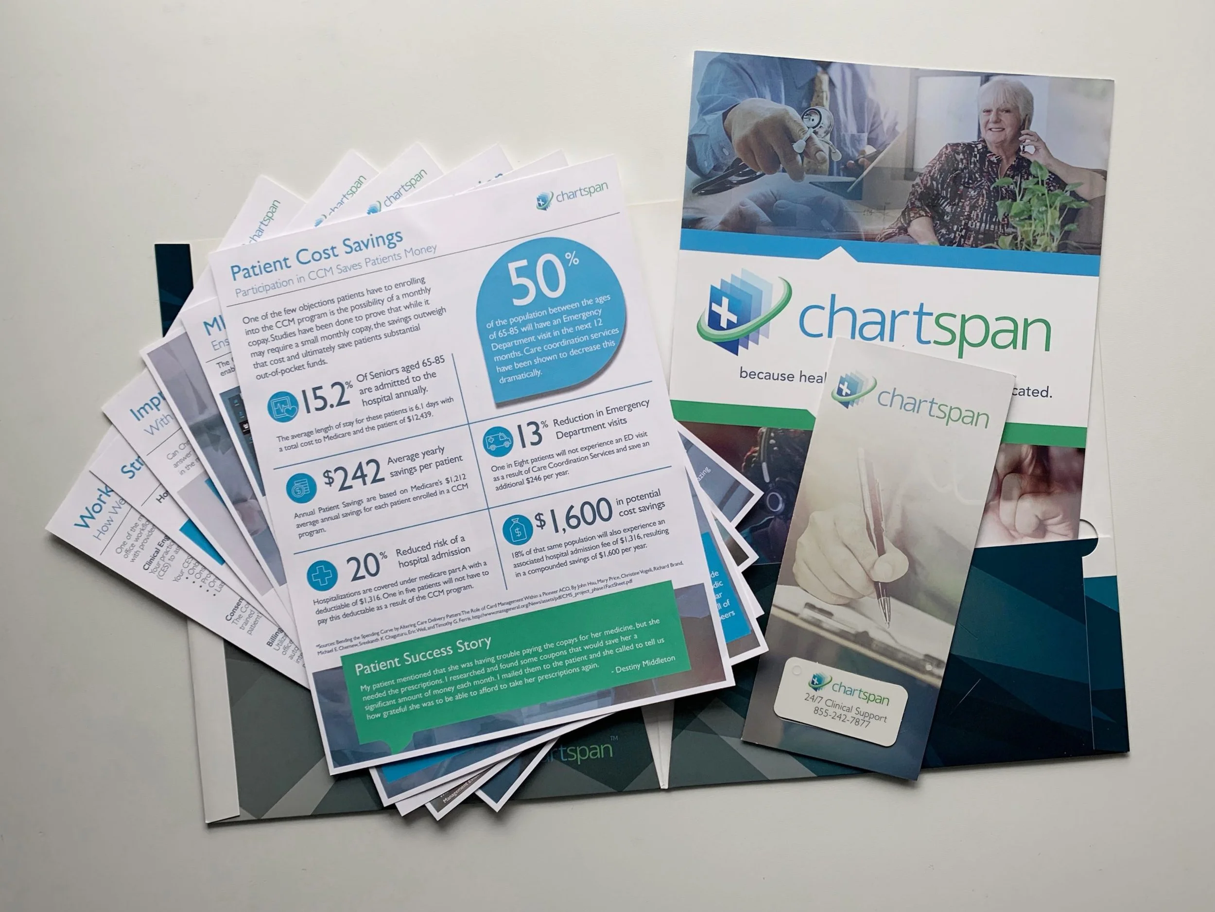
This is a closer look into the brochure with general information which is inside of the packet folder.
-
![]()
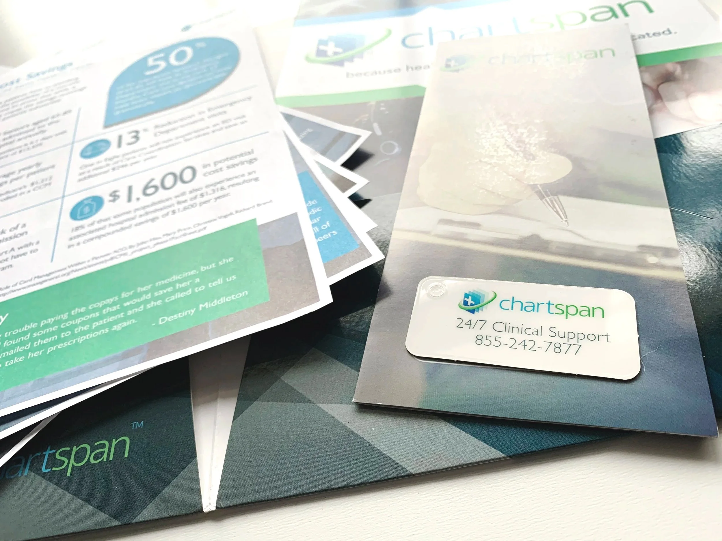
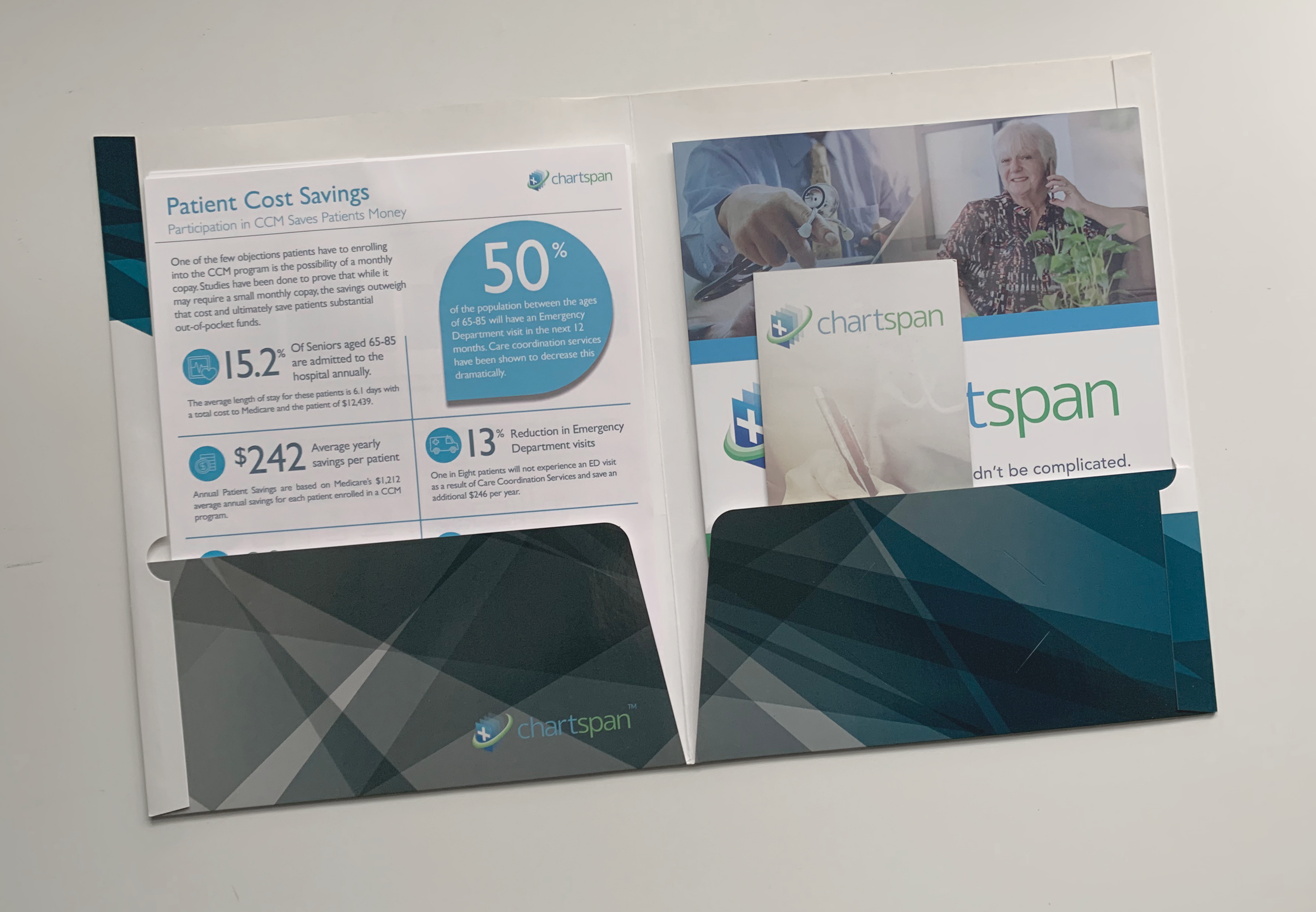
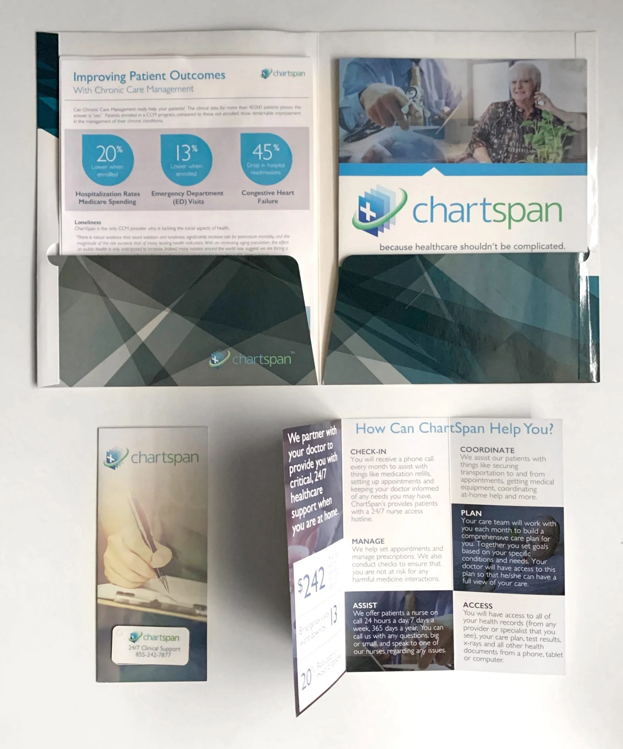
Inside the doctor’s packet was the doctor's brochure and tri-fold and six, one-page informational flyers for the sales team to help explain all of Chartspan’s services and the benefits of working with Chartspan.
-
![]()
Inside the patient packets was a short informational tri-fold about who Chartspan was and a more in-depth brochure. Since most of the patients who are chronically ill are older, we created a key-chain tag to keep Chartspan at arm’s reach and also giving them the correct phone number if they ever needed to call the triage nurses at Chartspan.
-
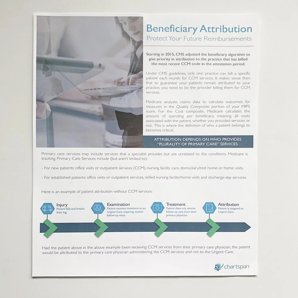
![]()
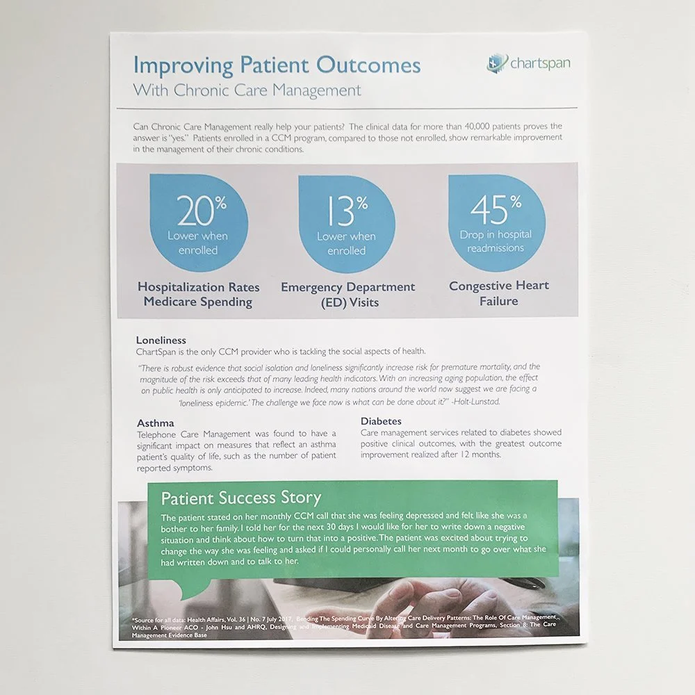
This is one of the flyers that was inside of the Doctor's packets describing the beneficial patient outcomes if they were to partner with ChartSpan.
-
![]()
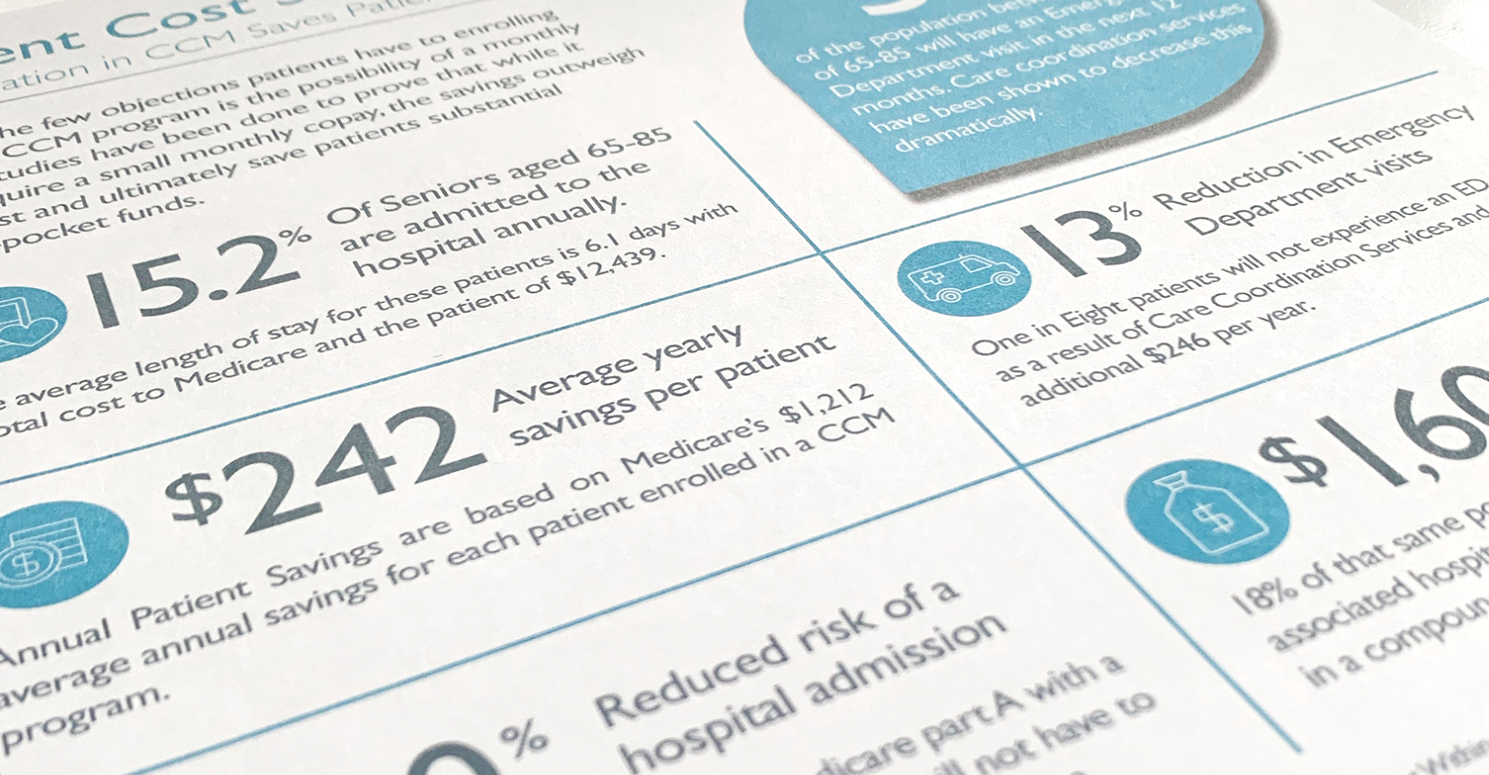
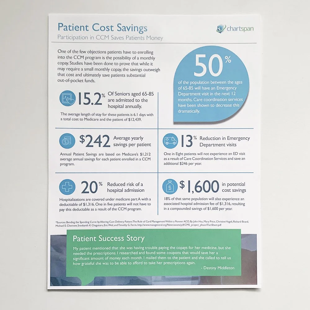
Here is one of the flyers that was inside of the Doctor's packets and patient packets describing the beneficial patient cost savings if they were to use ChartSpan.
-
![]()
This is one of the flyers that was inside of the Doctor's packets and patient packets describing the beneficial patient cost savings if they were to use ChartSpan.
-
![]()
Seen here is one of the flyers that was inside of the Doctor's packets describing the benefits of added revenue when partnering with ChartSpan.
-
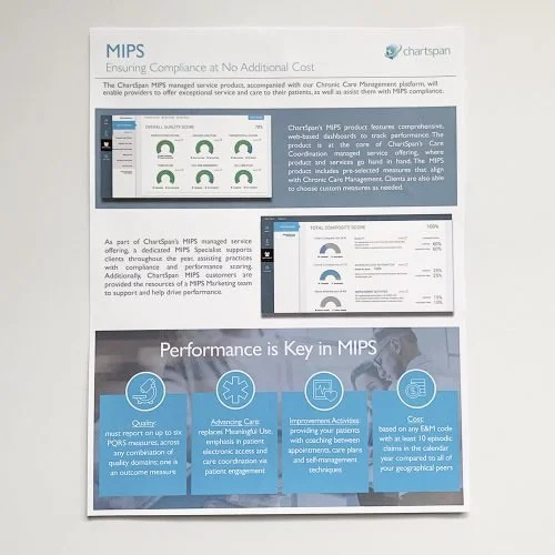
![]()
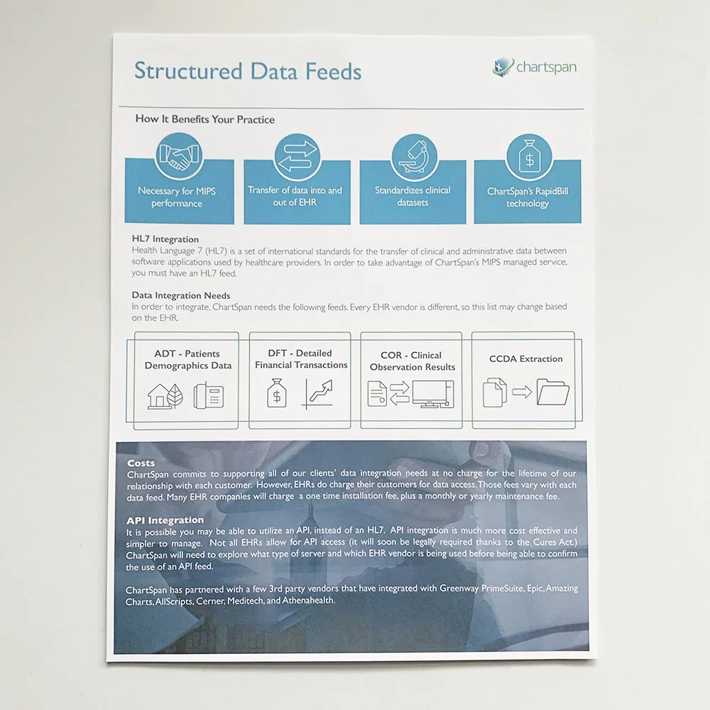
This is one of the flyers that was inside of the Doctor's packets describing how ChartSpan kept them compliant with MIPS laws.
-
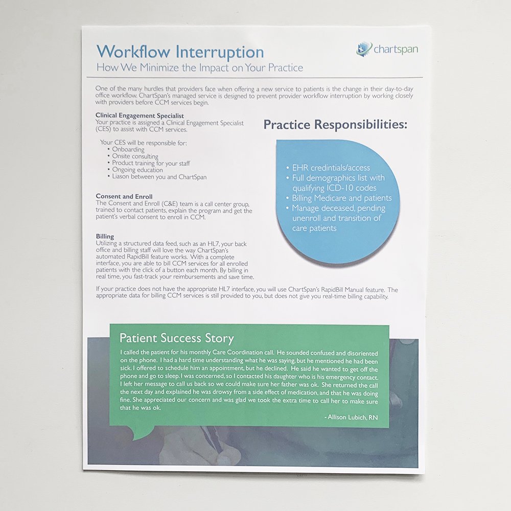
![]()
This is one of the flyers that was inside of the Doctor's packets describing the benefits in partnering with ChartSpan.
-
![]()
Collateral overview
-
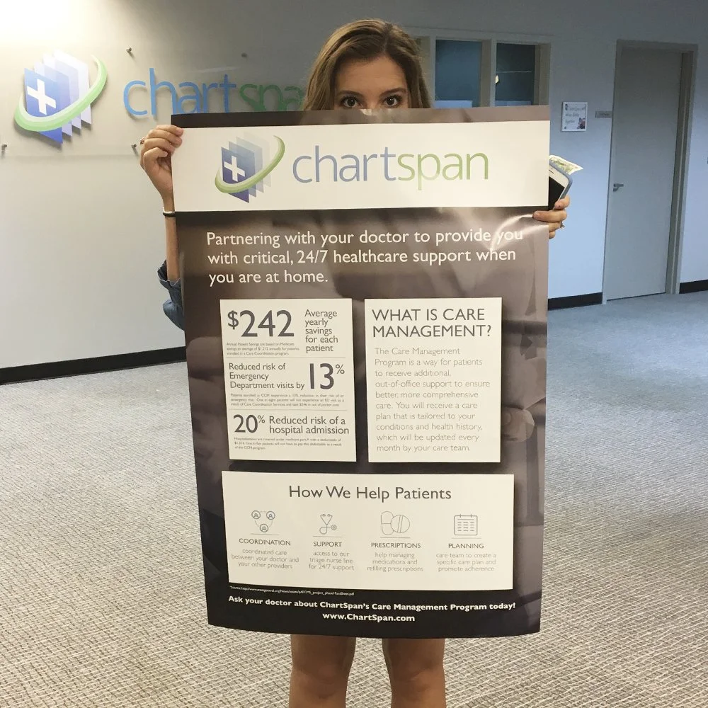
![]()
This is my coworker holding up the poster that I was able to create to go in the doctors office and help with brand recognition amongst the patients.
project stats
20%
Decrease in patient hospitalization spending.
13%
Decrease in patient emergency department visits.
45%
Decrease in patient re-hospitalization.
Digital Campaign Strategy
Aligned with ChartSpan’s goal of presenting a modern, approachable brand within a highly regulated space, I concepted and executed targeted digital campaigns across patient and provider audiences.
Patient-facing ads highlighted cost savings and proactive triage support as an alternative to unnecessary ER visits. Provider-focused campaigns, deployed across LinkedIn and Google, emphasized compliance support and revenue opportunities for practices. Additional patient campaigns reinforced the simplicity and convenience of centralized medical record management.


Website refresh
The website wasn’t just a redesign—it was a translation layer.
ChartSpan’s model is complex, with multiple audiences navigating compliance, care coordination, and value-based outcomes. The goal wasn’t to simplify the message— it was to structure it.
The site was designed to clearly guide physicians, administrators, and partners through what ChartSpan does, how it works, and why it matters—without overwhelming them. Each section was built to reduce friction, reinforce credibility, and make the value of the program immediately understandable.

Outcome
This project reinforced my approach to brand leadership: start with strategy, respect constraints, build systems, and execute with intention. When complexity is handled thoughtfully, clarity becomes a competitive advantage.