From Operational Complexity to Brand Clarity
Benefit first is a private, cloud-based, SaaS company who sells a benefits eligibility management product that automates and supports an employer’s complete benefits cycle for both the employee and the HR team.
When I joined BenefitFirst, the brand wasn’t broken… it just wasn’t cohesive.Marketing looked one way. Product looked another. And scalability? Let’s just say it was optimistic.
My role was to bring clarity.
I established a structured design system, created reusable components, and aligned marketing and product visuals under one cohesive framework. The goal wasn’t just to “make it look better.” It was to reduce friction, increase consistency, and make future design decisions easier (and faster).
Because good design isn’t decoration — it’s infrastructure.
-
BenefitFirst
-
As BenefitFirst evolved, its brand, product, and website no longer felt aligned. The challenge was to create a stronger visual identity and bring greater consistency, clarity, and polish across the SaaS platform and web experience.
-
Brand guidelines and visual system
Refined SaaS product experience
Website redesign aligned to the new aesthetic
Custom Illustrations
-
Creative direction, visual strategy, concept development, and design execution: Becky Ware
Copy and approval: The CEO, CTO, Benefit First team and Business Development
Brand foundations
BenefitFirst had a logo and “a blue.” What it didn’t have was a clearly defined system behind it.
The primary blue shifted depending on where you looked, which meant brand consistency was more… interpretive than intentional.
I standardized the core color values and expanded the palette into a structured system with defined roles: primary, secondary, and supporting neutrals. This created clarity, reduced ambiguity, and gave future design decisions a reliable framework to build from.
Because good branding isn’t just a color, it’s a rulebook.
Result: Eliminated visual inconsistencies across marketing and web assets and established a reliable color hierarchy for future campaigns.
Primary blue
#245CAB
Primary Variant
#00337A
Secondary Variant
#2f3530
Accent Gray
#55d892
Body Copy
#666666
Secondary blue
#249FAA
Design System Documentation 👇
Design System Documentation 👇
Concept exploration
I didn’t want to hand developers a pretty PDF and say, “Good luck.”
Instead, I built an interactive design system in Adobe XD that functioned as a working reference. Developers can click into elements and instantly access typography specs, spacing rules, color values, and even supporting CSS/HTML snippets.
The goal wasn’t just documentation- it was operational clarity.
I also created a simplified web branding guide to begin standardizing the internal site, which at the time was… creatively inconsistent. This system became the starting point for aligning internal pages with the broader brand language.
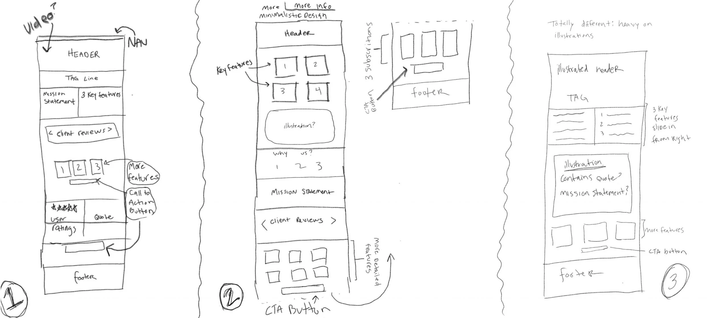
I began with pen and paper to explore layout structure, content hierarchy, and overall flow. Early sketching allowed for rapid iteration before moving into higher-fidelity prototypes in Adobe XD.
Rather than presenting a single direction, I intentionally developed three distinct concepts:
One closely aligned with the client’s initial vision
One that introduced thoughtful variation
One that pushed the boundaries of what they might expect and blow their minds
This structured approach gave stakeholders clarity in decision-making, created productive discussion, and ensured the final direction was chosen with confidence — not guesswork.
This process also surfaced key priorities around messaging clarity and feature hierarchy, which directly informed the final design system.
01
The CEO was interested in incorporating video, so this direction leaned into a dynamic header to establish credibility and scale.
Supporting animations were used intentionally to guide hierarchy and create engagement — not just visual flair.

02
As the brand aimed to feel more modern and approachable, this direction introduced lighter layouts and illustration.
The goal was to humanize the experience while maintaining clarity and trust.

03
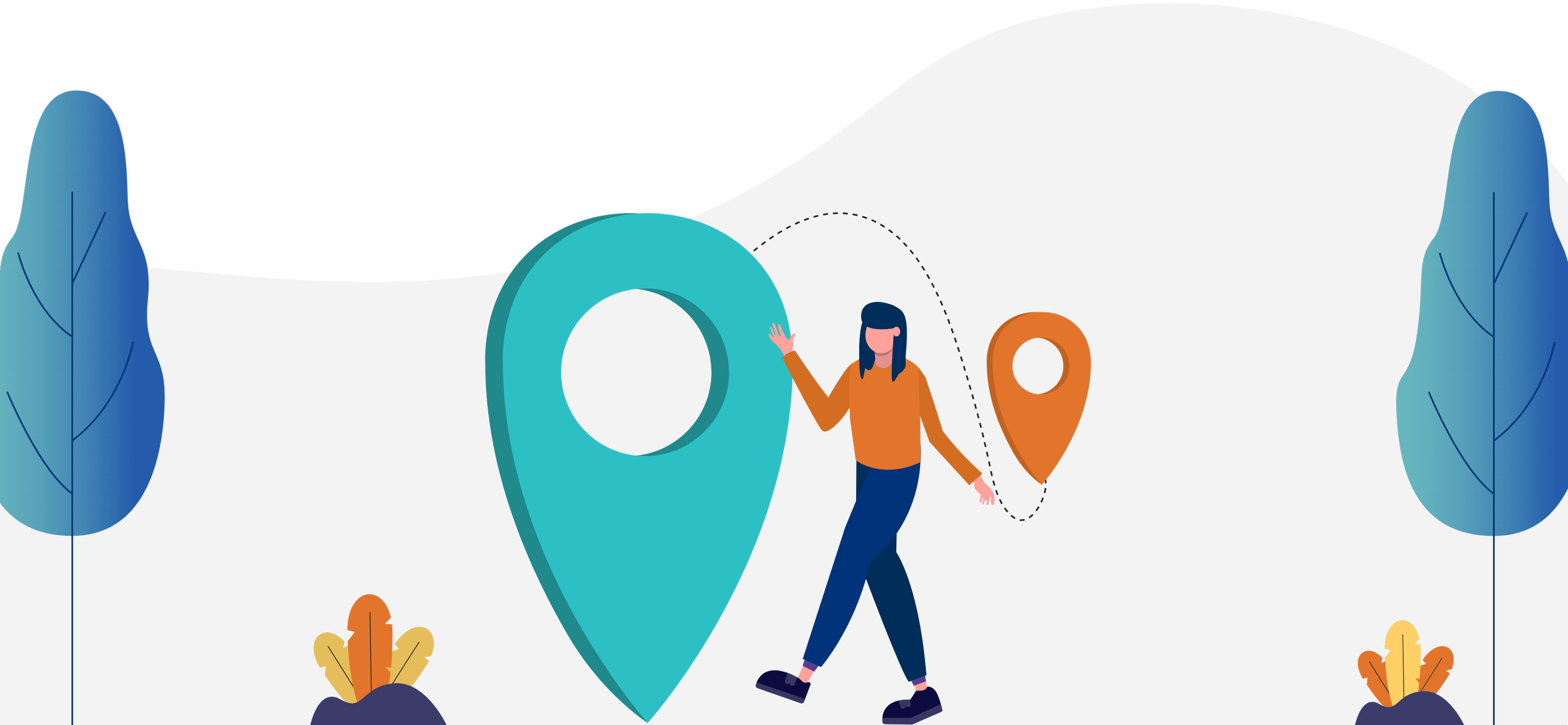
This one was a complete surprise to everyone- it used visual metaphor to represent the benefits process as a journey.
By leaning into bold illustration, it positioned BenefitFirst as a guide- not just a platform.

the solution
Leadership gravitated toward the narrative-driven direction and encouraged further exploration of the concept.
The final design positions BenefitFirst as a guide through an often overwhelming process. The journey metaphor shaped the illustration system, messaging tone, and user experience.
From illustration to UI components to user flow, every element was designed intentionally to align story with structure.
The result: a cohesive brand and web experience that feels both supportive and structurally clear.
Please enjoy!
Transformations 👇
Transformations 👇
About Us Pages


Redesigned 👍🏻
Before 😅
Login Pages
Before 😅
Redesigned 👍🏻
Subscription Pages
Before 😅
Redesigned 👍🏻
Homepages


Before 😅
Redesigned 👍🏻
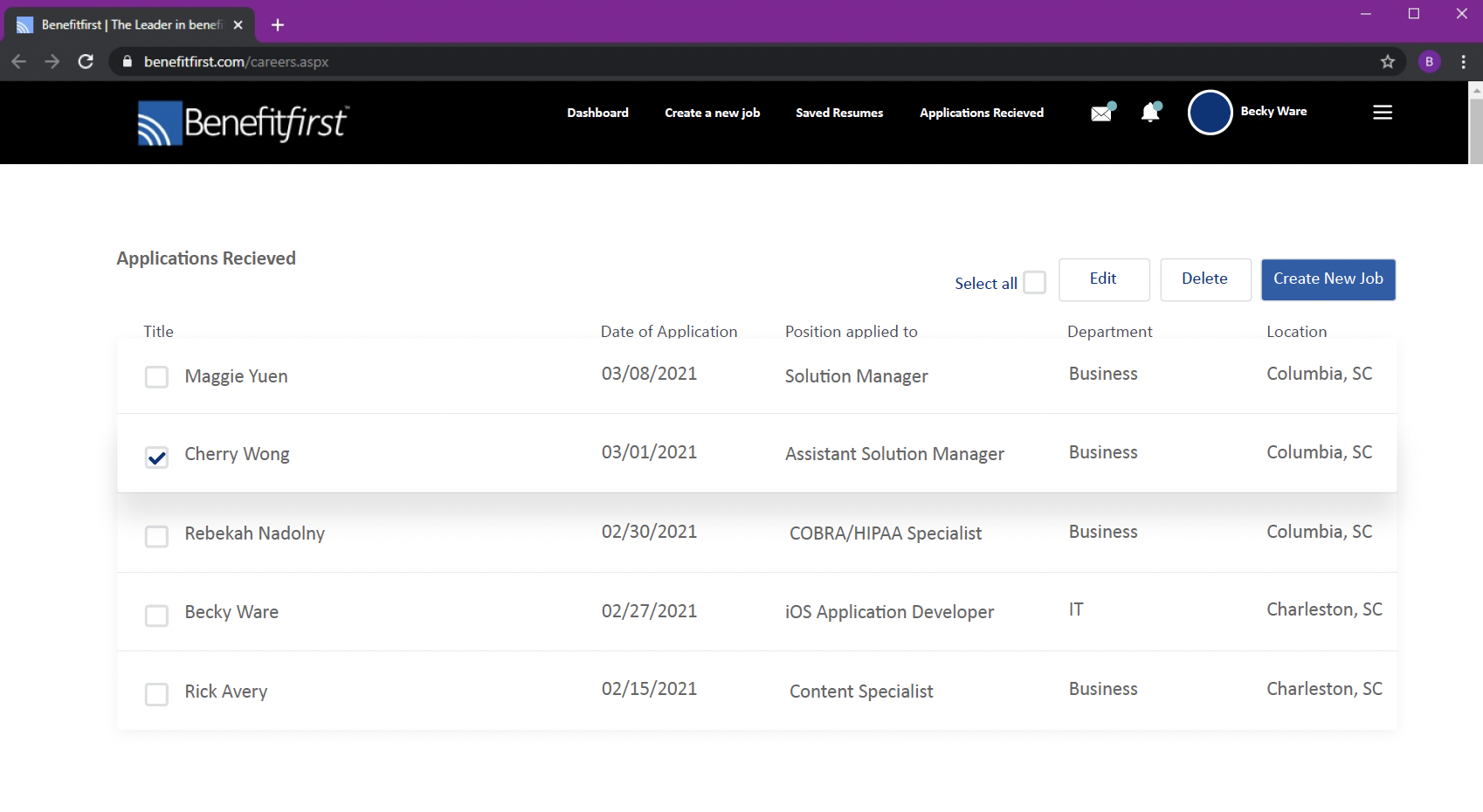
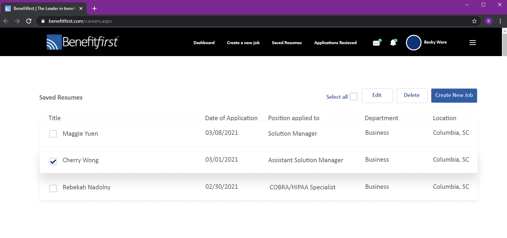
Job listing Pages


Before 😅
Redesigned 👍🏻
responsive design
The site was designed mobile-first, with structured breakpoints across desktop, tablet, and mobile.
Rather than relying solely on fluid scaling, I defined layout adjustments intentionally at each size to preserve hierarchy, readability, and brand consistency.
This ensured the visual system translated seamlessly across devices- without compromising clarity or user flow.
This approach reduced layout inconsistencies and simplified developer implementation across screen sizes.


job listings


As an extension of the main site, the careers experience was redesigned to maintain visual consistency while improving usability.
The listing page provides a clear overview of available roles, while individual job pages surface related opportunities to encourage continued engagement. The goal was to create a cohesive experience that supports both brand alignment and candidate conversion.
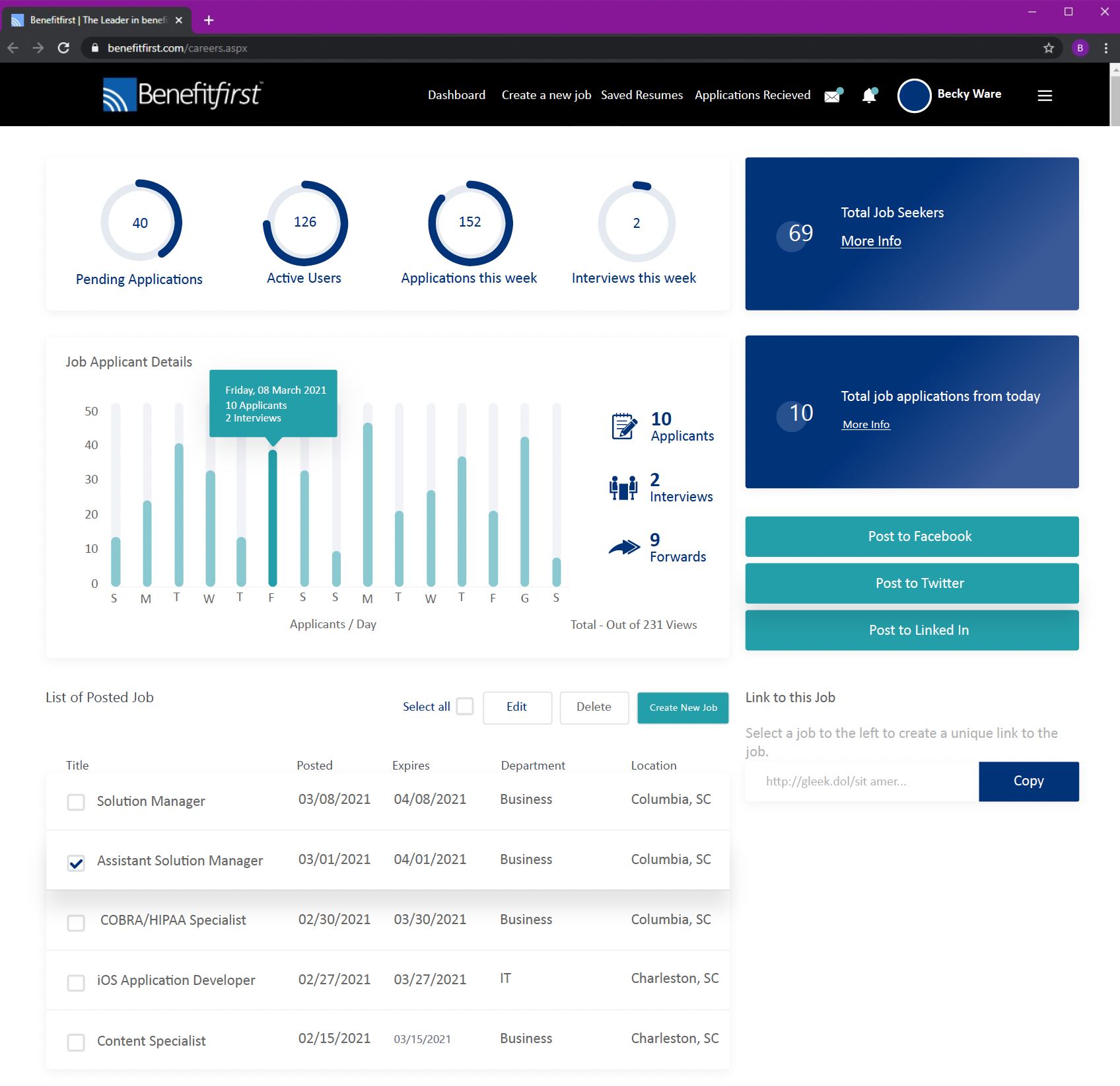
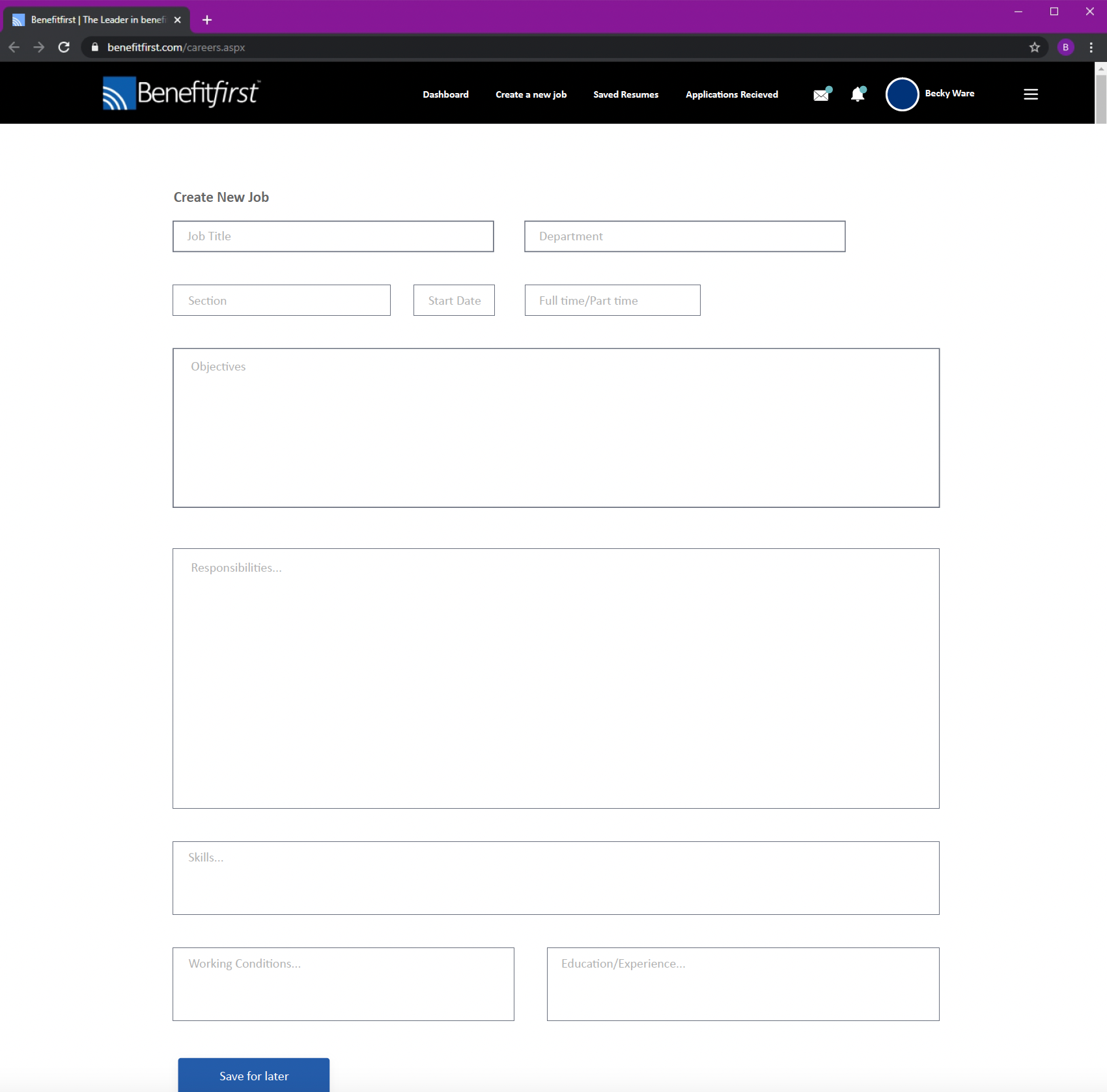
Job listings - admin dashboard
Outcome
This project was a good reminder that the real work isn’t just making individual screens look better, it’s building a system that can hold up as the brand grows. Bringing brand, product, and web into closer alignment created a stronger foundation for consistency, scalability, and a more polished experience overall.